CMYK vs. Spot Colors in Packaging Printing: What CPG Brands Need to Know
When it comes to packaging printing, one of the most important decisions brands make is how color is produced. The choice between CMYK (four-color process) and spot colors directly impacts brand consistency, print quality, cost, and overall packaging performance.
This guide breaks down the differences in a clear, practical way so CPG teams, designers, and packaging engineers can make informed decisions.
What is CMYK (Four-Color Process Printing)?
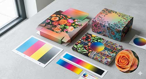
CMYK stands for Cyan, Magenta, Yellow, and Black. These four inks form the foundation of subtractive color theory, which is used to reproduce full-color images in printing.
Instead of printing solid colors, CMYK works by layering tiny dots of each color at varying sizes and densities to create the illusion of a full spectrum of colors.
How CMYK Printing Works
- Images are broken down into dot patterns (halftones)
- Dot size changes to simulate light and dark areas
- Measured in LPI (lines per inch), which determines resolution
- When aligned correctly, dots form a rosette pattern
- Misalignment can cause moiré patterns, leading to visual distortion
Think of it like a pointillism painting: up close, you see dots. From a distance, you see a complete image.
When to Use CMYK in Packaging
CMYK is ideal for:
- Photographic images
- Complex gradients and shading
- Multi-color artwork
- Cost-efficient, high-volume printing
Pros of CMYK
- Reproduces millions of colors
- More cost-effective for complex designs
- Standard for most commercial printing
Limitations of CMYK
- Less precise for exact brand colors
- Color can vary across materials and print runs
- Not ideal for strict brand color matching
What Are Spot Colors in Packaging Printing?
Spot colors are pre-mixed inks created to match a specific color exactly. Instead of building color from dots, the printer applies a single, solid ink.
These are often defined using systems like Pantone Matching System (PMS).
How Spot Colors Work
- Each color is printed using its own dedicated plate
- Ink is mixed to achieve a precise, repeatable color
- Can be printed as:Solid fills
- Halftones
- Vignettes (gradients)
For example, brands like Target rely on a specific red that must look identical across every package. That level of consistency is achieved using spot color, not CMYK.
Why Spot Colors Matter
Spot colors are critical when:
- Brand consistency is non-negotiable
- You need low Delta E (minimal color variation)
- Packaging must match across multiple substrates and print runs
Pros of Spot Colors
- Highly accurate color matching
- Strong consistency across materials
- Vibrant, solid color appearance
Limitations of Spot Colors
- Can be more expensive for multi-color designs
- Requires additional plates per color
- Less flexible for complex imagery
Most importantly, Sunrise 2027 is not only an IT project. Marketing, packaging, operations, and retail teams must work together so the encoded data, printed code, and digital experience all align.
CMYK vs. Spot Colors: Key Differences
| Feature | CMYK (Four-Color Process) | Spot Colors |
|---|---|---|
| Color Creation | Built from dots of 4 inks | Pre-mixed single ink |
| Accuracy | Moderate | Very high |
| Best For | Photos, gradients, complex designs | Brand colors, logos |
| Cost | More efficient for many colors | Higher with multiple colors |
| Consistency | Can vary | Highly consistent |
| Print Method | Halftone dots (LPI-based) | Solid ink application |
CMYK vs. Spot Colors in Packaging: Use Cases
Use CMYK When:
- Printing retail packaging with images (food, beauty, CPG)
- You need visual depth and gradients
- Budget efficiency is important for multi-color designs
Use Spot Colors When:
- You must match strict brand guidelines
- Printing logos or key brand elements
- Color consistency across SKUs is critical
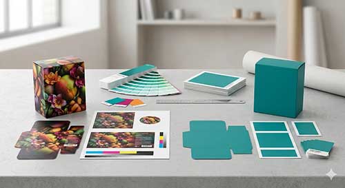
Use Both Together
Many packaging designs combine both methods:
- CMYK for images and backgrounds
- Spot colors for logos and brand-critical elements
This hybrid approach balances cost, flexibility, and precision.
Why Color Choice Matters More Than Ever
As packaging evolves with trends like smart packaging, sustainability, and digital printing, color accuracy plays a larger role in:
- Brand recognition at shelf
- Print performance across materials
- Scannability for barcodes and QR codes
- Consumer perception and trust
Initiatives like Sunrise 2027 reinforce this shift. As packaging takes on more finctional roles, such as carrying scannable 2D codes, brands must balance visual design with print accuracy and contrast to ensure both strong shelf presence and reliable performance.

How to Choose the Right Approach for Your Packaging
Ask these questions:
Is brand color accuracy critical?
→ Choose spot colors
Does the design include photography or gradients?
→ Use CMYK
Are you printing across multiple substrates?
→ Consider spot for consistency
Do you need both flexibility and precision?
→ Combine CMYK + spot
Why a Packaging Partner Matters
Choosing between CMYK and spot colors is not just a design decision. It is a production decision that impacts:
- Print quality
- Material compatibility
- Cost efficiency
- Brand consistency
An experienced packaging partner helps you:
- Optimize color strategy for your design
- Maintain consistency across labels and cartons
- Test print performance on real substrates
- Balance cost with visual impact

Key Takeaways
- CMYK uses four inks and halftone dots to create full-color images
- Spot colors use pre-mixed inks for precise color matching
- CMYK is best for complex visuals, while spot colors are best for brand consistency
- Many packaging designs benefit from a hybrid approach
- Color decisions directly impact print quality, cost, and brand perception
Related Blogs:
- Design Strategies That Maximize the Impact of Carton Packaging in 2026
- Hybrid Flexo Printing: The Evolution of Label Printing Technology
- Product Packaging Design: How Psychology Shapes Effective Sustainable Packaging
- Color Palettes That Sell: Mastering Carton Box Packaging
FAQs: CMYK vs Spot Colors in Packaging Printing
CMYK uses four inks (cyan, magenta, yellow, and black) to create colors through layered dots, while spot colors use a single pre-mixed ink to produce an exact color. CMYK is best for complex images, whereas spot colors are used for precise brand color matching.
Use CMYK for designs with photographs, gradients, or multiple colors. Use spot colors when you need consistent, accurate brand colors such as logos. Many packaging designs combine both for the best results.
Spot colors are pre-mixed to a specific formula, which ensures consistent color output across print runs and materials. CMYK builds colors using dot patterns, which can lead to slight variations and less precision.
A Pantone or PMS color is a standardized spot color created using a specific ink formula. It ensures that a brand color looks the same every time it is printed, regardless of printer or substrate.
CMYK can approximate brand colors, but it cannot always match them exactly. For critical brand colors where consistency is essential, spot colors are the preferred option.
CMYK is generally more cost-effective for designs with many colors because it uses only four printing plates. Spot colors can increase costs since each color requires its own plate, especially in multi-color designs.
Yes, many packaging designs use a combination of CMYK and spot colors. CMYK handles images and gradients, while spot colors ensure brand elements like logos remain consistent and accurate.
Last Updated on June 9, 2026