Color Psychology in Visual Merchandising and Retail Displays
In the dynamic world of retail, every detail matters–especially color. Color psychology has emerged as a powerful tool in shaping customer perceptions, emotions, and purchasing behaviors. Beyond the tangible products on display, the choice of colors in retail environments plays a pivotal role in crafting engaging and immersive shopping experiences.
Whether it’s the vibrant hues adorning a storefront, the carefully selected colors of retail product packaging, or the strategic arrangement of items within a store, color psychology guides how consumers interact with and respond to retail displays.
In this infographic, learn the role of color in visual merchandising and retail displays and uncover how it can influence, inspire, and elevate the retail experience for both brands and consumers alike.
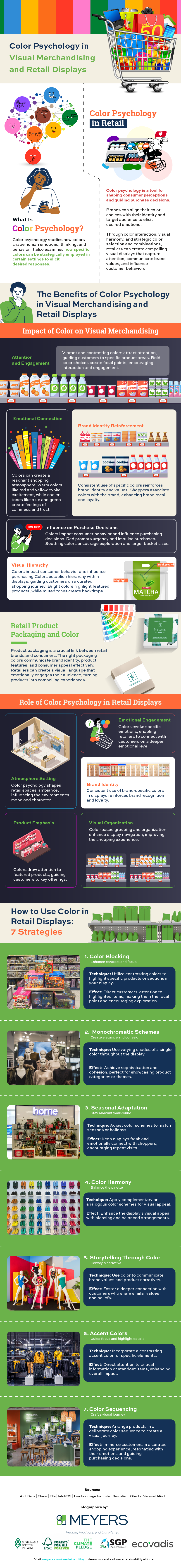
What is Color Psychology?
Color psychology is a specialized study investigating how colors influence human emotions, cognition, and behavior. Colors trigger neurological and physiological responses in the human brain, leading to specific emotional reactions.
Warm colors like red and orange are associated with excitement and urgency, while cooler colors like blue and green evoke a sense of calmness and tranquility. Neutrals such as white and gray are often linked to simplicity and neutrality.
What is Color Psychology in Retail?
In retail, color psychology is a potent tool for shaping consumer perceptions and guiding decision-making processes. Brands can align their color choices with their identity and target audience to elicit desired emotions. For instance, a high-end brand might opt for deep, rich colors to convey sophistication and exclusivity, while an eco-friendly brand could utilize natural tones to resonate with sustainability.
The integration of color psychology in retail involves a deep understanding of how colors interact and how they can create visual harmony within a store environment. By strategically selecting and combining colors, retailers can create custom retail displays that capture attention, communicate brand values, and influence customer behaviors.
The Benefits of Color Psychology in Visual Merchandising and Retail
Impact of Color on Visual Merchandising
The impact of color on visual merchandising is profound, influencing customers’ perceptions, emotions, and purchasing behaviors. Strategic use of color can elevate the overall shopping experience, transforming retail spaces into engaging environments that resonate with shoppers subconsciously. Here are notable benefits of harnessing color psychology in visual merchandising.
1. Attention and engagement
Vibrant and contrasting colors attract attention, guiding customers’ gaze toward specific products or areas. Bold color choices can create focal points within displays, encouraging shoppers to explore and interact with merchandise. The careful placement of eye-catching colors can lead to increased dwell time and improved customer engagement.
2. Emotional connection
Colors evoke emotions and memories, allowing retailers to connect with their audience more deeply. Warm colors like red and yellow evoke excitement and energy, while cooler tones like blue and green elicit calmness and trust. By aligning color choices with the intended emotional response, retailers can create a more immersive and resonant shopping atmosphere.
3. Brand identity reinforcement
Consistent use of specific colors can reinforce a brand’s identity and values. When shoppers associate particular colors with a brand, they are more likely to recognize and recall the brand in the future. Integrating brand colors into displays communicates a cohesive brand image and enhances brand recall and loyalty.
4. Influence on purchase decisions
Different colors can impact consumer behavior and influence purchasing decisions. For instance, red is often associated with urgency and can prompt impulse purchases or limited-time offers. Soft, soothing colors might encourage shoppers to explore more, fostering a sense of comfort that can lead to larger basket sizes.
5. Visual hierarchy
Colors can be used to establish a hierarchy within displays, guiding customers through a curated shopping journey. Bright or contrasting colors can highlight featured products or promotions, while muted tones can create a backdrop that lets certain items stand out. This technique aids in guiding customers’ attention and shaping their navigation paths.
Retail Product Packaging and Color
In retail, product packaging is a critical touchpoint between brands and consumers. The choice of colors in product packaging plays a pivotal role in conveying brand identity, product attributes, and consumer appeal. It’s a non-verbal communication that speaks volumes, often influencing the decision-making process.
Whether it’s the vibrant hues of a cereal box that promise a burst of energy in the morning or the soothing colors of beauty packaging that evoke a sense of relaxation, color psychology in retail product packaging is vital for creating memorable and persuasive brand experiences.
Role of Color Psychology in Retail Displays
Color psychology plays a pivotal role in the success of retail displays, shaping the overall shopping experience and influencing customer behavior. Here is how color psychology enhances retail displays.
1. Atmosphere setting
Imagine stepping into a retail store bathed in warm, inviting hues of amber and earthy tones. The ambiance feels cozy and welcoming, encouraging you to explore leisurely. Conversely, a different store employs bold, vibrant colors that infuse the space with an energetic, dynamic vibe.
In both scenarios, color psychology is at play, meticulously chosen to set the tone and atmosphere that aligns with the brand’s identity and the products on display. Whether it’s creating a sense of relaxation or excitement, the strategic use of color transforms the retail environment into an immersive customer experience.
2. Emotional engagement
Colors have a profound ability to evoke emotions and stir feelings. Blues and greens can instill calmness and trust, while fiery reds and yellows ignite excitement and energy. This emotional resonance is harnessed in retail displays to connect with customers on a deeper, often subconscious, level.
The color palette chosen for a display can evoke the desired emotional response, whether the soothing colors in a spa product showcase or the vibrant hues in a fashion boutique that incite a sense of adventure. The result is a more profound and memorable connection between the customer and the brand, fostering interaction and loyalty.
3. Brand identity
One of the cornerstones of effective branding is consistency, and color plays a pivotal role in reinforcing brand identity. Retailers use specific colors consistently across various touchpoints, from logos to packaging and, of course, in retail displays.
This strategic alignment of color schemes ensures that customers instantly recognize and connect with the brand. When shoppers encounter the familiar brand colors in displays, it fosters trust, loyalty, and a sense of authenticity. It’s a visual language that speaks volumes, communicating the essence and values of the brand.
4. Product emphasis
Not all products are created equal within a retail display, and retailers understand the importance of highlighting specific offerings. Color psychology comes into play by using contrasting or attention-grabbing colors to draw focus to key products or promotions.
These carefully chosen colors act as visual beacons, guiding customers’ attention and enticing them to explore further. Whether it’s a limited-time promotion or a flagship product, color subtly communicates that this is worth exploring.
5. Visual organization
Navigating through a retail space should be a seamless and enjoyable experience. Color psychology contributes to visual organization within displays. Retailers use color-based grouping and organization to enhance the efficiency of shopping. For instance, products with complementary colors may be displayed together, making it easier for customers to find coordinating items. This approach not only simplifies the shopping process but also adds to the overall aesthetics of the display, creating a visually pleasing and cohesive shopping environment.
How to Use Color in Retail Displays: 7 Strategies
To master the art of using color effectively, retailers employ various techniques and strategies to create compelling and impactful displays. Here are methods that form the foundation of this artful practice.
1. Color Blocking: Enhance contrast and focus
Utilizing color blocking involves juxtaposing contrasting colors to draw attention to specific products or sections within a display. For instance, placing brightly colored items against a muted backdrop creates a visual contrast that makes those items stand out.
This technique guides customers’ eyes directly to the highlighted products, making them the focal point of the display and encouraging exploration.
2. Monochromatic Schemes: Create elegance and cohesion
Monochromatic schemes use varying shades and tones of a single color throughout the display. For example, a display featuring various shades of blue can create a harmonious and visually pleasing arrangement.
Monochromatic displays exude sophistication and visual cohesion, offering a clean and elegant shopping experience. They work well for showcasing product categories or themes.
3. Seasonal Adaptation: Stay relevant year-round
Adapting color schemes to match seasons or holidays is a common strategy. For example, warm, earthy tones can be employed in autumn displays, while bright pastels may dominate during spring.
Seasonal adaptations keep displays fresh and aligned with the current zeitgeist, fostering an emotional connection with shoppers and encouraging repeat visits.
4. Color Harmony: Balance the palette
Employing color harmony techniques such as complementary or analogous color schemes ensures that colors work together harmoniously. Complementary colors, like blue and orange, create contrast and vibrancy, while analogous colors, like blue and green, offer a more serene and coordinated feel.
Color harmony enhances the visual appeal of displays, creating a pleasing and balanced arrangement that appeals to shoppers.
5. Storytelling through Color: Convey a narrative
Retailers use color to tell a story or convey a specific message. For instance, a display featuring earthy tones, greens, and organic textures communicates a commitment to sustainability and eco-friendliness.
This strategy allows retailers to communicate brand values and product narratives through color, fostering a deeper connection with customers who share similar values.
6. Accent Color: Guide focus and highlight details
Using an accent color involves incorporating a single, contrasting color into an otherwise harmonious display. This accent color draws immediate attention to specific elements like product details, pricing information, or promotional signage.
Accent colors act as visual cues, guiding customers to critical information or standout items within the display. They create a sense of hierarchy and importance, enhancing the overall impact of the display.
7. Color Sequencing: Craft a visual journey
Color sequencing entails arranging products or display elements in a deliberate color sequence. For instance, a display might transition from cool, calming colors to warm, energetic tones, creating a visual journey that mirrors the customer’s emotional progression through the space.
This technique immerses customers in a curated shopping experience, leading them through a deliberate narrative that resonates with their emotions and needs. It encourages exploration and engagement while subtly guiding purchasing decisions.
Displays Done Right
Understanding the intricate interplay between color and psychology is key to unlocking the full potential of retail space. As retailers strive to stand out in a competitive landscape and create meaningful connections with their target audiences, the strategic use of color becomes a critical component of their arsenal.
From mesmerizing displays that beckon customers into stores to thoughtful color palettes that encapsulate brand identities, color psychology has helped redefine the art and science of retail.
Want to learn more about techniques and insights for achieving retail excellence? Connect with the experts at Meyers—your sustainable partner for retail displays, folding cartons, RFID solutions, and pressure sensitive labels. Discover how every element of your packaging and display strategy can work together to express the essence of your brand and capture attention where it matters most.
Last Updated on April 27, 2026